About
UX design student with a literary background.
Love when the chewing gum packaging is perfect at 7/11, a good breakfast roll, Lars Norén, swim in the ocean and great design.
Currently looking for an internship autumn 2024.
UX design student with a literary background.
Love when the chewing gum packaging is perfect at 7/11, a good breakfast roll, Lars Norén, swim in the ocean and great design.
Currently looking for an internship autumn 2024.
Who am I and how can the design speak for me? I want it to be simple. I want it to be a little messy, a little tricky, a little fun. I like to write. In this process, it has been important to sketch in Figma, compare, reflect and discuss which design works, which is fun and which is too simple.
For fun, I tried to get my color palette according to color analysis with the help of Chatgpt. But when I came across the collection of poems ’Hunger’ by the publisher Blombergs, I visualized how the site could develop into a writing notebook with content about my various works. But maybe to easy? To be continued.

This case study is divided into two projects. A web application and a mobile application. The work for the web application is a group project while the project for the mobile application is an individual project based on the group project.
In both projects we would develop wireframes and a testable hi-fi prototype. We would define and justify the target audience, client and budget. Define the problem and solution to the most important task users have, explain the choice of graphic design and aesthetics. Refer to usability and design principles anchored in research data.
Lidl is a German grocery chain with only discount stores. Lidl has been present in Sweden since 2003 and has 205 stores. Lidl has no e-commerce. Lidl.se is primarily for information.
Lidl's website was difficult to navigate and visually messy. It was inconsistent on several levels. Our goal for the web application was to create an easier website to navigate and a visually attractive website with a minimalist and consistent design.
For the mobile application I wanted to make it easier for users to find ”Offers” and “Stores”. Accessibility and information is the main key for users. The mobile application needed to be easy navigable and consistent with minimalist and appealing design.
A price-conscious target group such as students, pensioners, low-income earners.
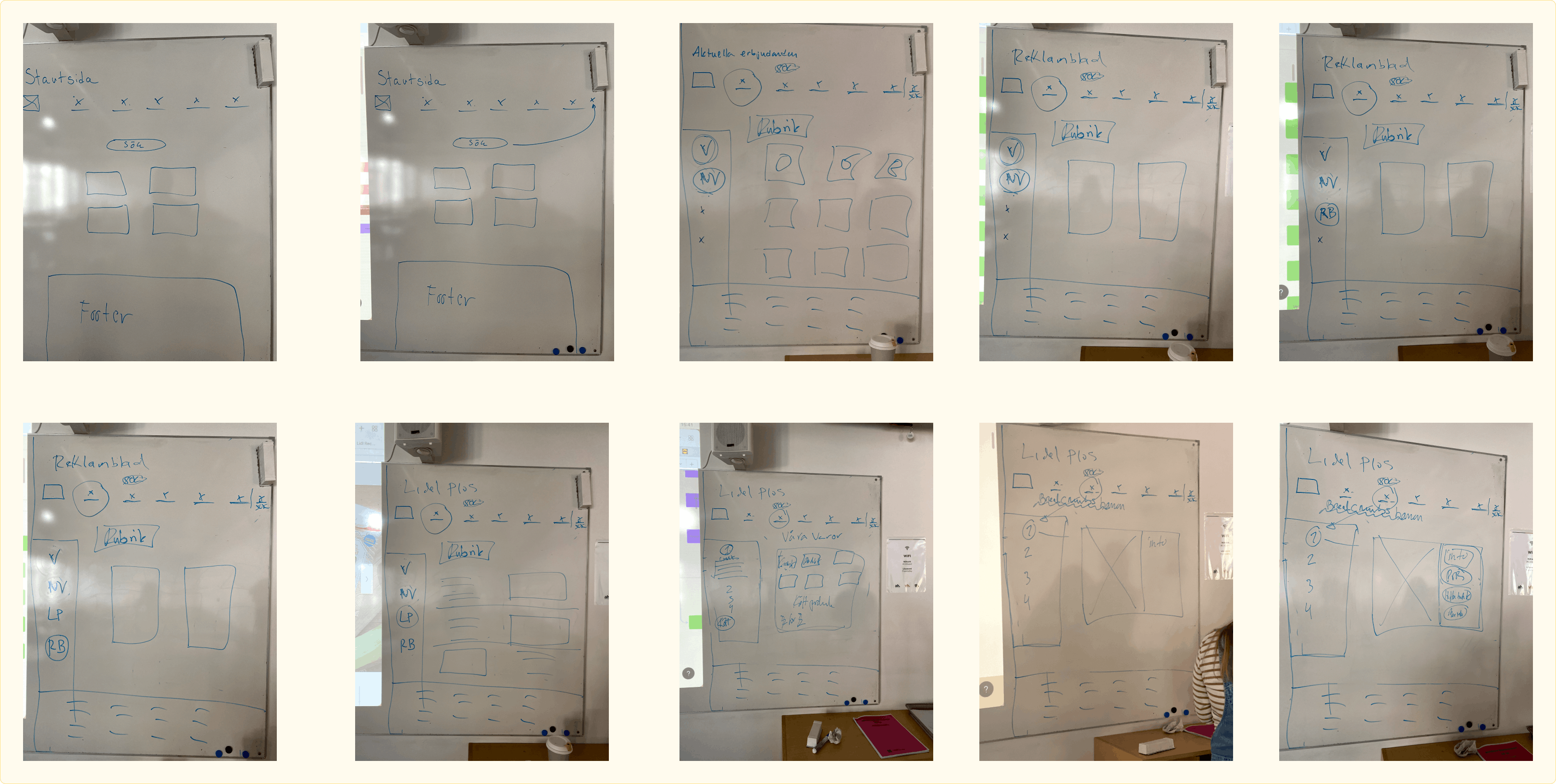
The case study process consists analyzing the existing website, defining the problem, client and target group. User testing of existing website, analysis and prioritization data. Benchmarking. Create a new information architecture for the website. Paper sketches, digital wire-frames and lo-fi sketches in Figma. Design critique workshops. Development of user tests, user tests and analysis. Moodboards, analysis of visual elements and last but not least a Hi-fi prototype in Figma. Insights and reflections on the project and further development opportunities.
We analyzed Lidl's website using the 10 Usability Heuristics for User Interface Design. Our priority points:
We defined five hypotheses and five tasks for the testers. User testing was performed on a dispersed user group based on Lidl's target audience. When analyzing the data, we found that the user testing confirmed our analysis of the website. A few insights:
Sketches of the new information architecture of the web application.


It was essential to use Lidl's colors. As Lidl's graphic profile is well known, established in the market and have a strong brand. In addition to Lidl's colors, we wanted to use two types of white, one for background and another for cards. This is to create movement and not give too hard an impression and follow the design conventions that exist, such as standard icons, soft shapes, white spaces, repetition and clear direction in flows.
During a workshop feedback was given on: efficient and logical flows, interactive and intuitive, accessibility and feedback. We also looked at visual elements such as hierarchy, proximity principle/white space, choice of colors and fonts, “finish” in elements and symmetry.
We defined five new hypotheses and designed five new tasks for the testers. The user testing was performed on both a new user group and from the old group who had been testing the existing site. The outcome of the testing was positive as the testers were able to successfully complete their tasks. Feedback from the group of testers who had previously been involved was mainly how easy it was to navigate and find the tasks on the site.


Possibility of onboarding in the mobile application. To improve the accessibility and explainability of the app for inexperienced users such as the elderly group. Design elements and features to allow users to save or favor specific stores and offers.
Continuous design criticism. More time for research, for example in this case to research what kind of ingrained patterns already exist in this type of web and app application. New solutions are not always the most user-friendly solution and always work in iterations.